3 FAVES

- Line Detailing of this stamp is very appealing to the eye with its various widths
and intersections - The rule of thirds was executed very well with the dark circle being the main attraction point.

- I like that the image has a lot of responsibility in attaining the perception of an entire nation. Which it does with the focus being on the African elephant (which has bigger ears than the Asian).
- I like the feel of the stamp and its price.

- I like the simplicity of the main image, its angles, shapes and overall orientation
- The use of negative space was well thought of along with its overall layout
MOVEMENTS
Bauhaus

- I enjoy the layout of this image. Everything from the text to the color of the image, the thickness of the lines and excellent use of negative space, all correlate.
- The fact that its more art than advertisement


Art Deco

CONSTRUCTIVISM

- I like the shades, color and overall texture of this piece.
- The interaction of the partial radii of each element was wonderfully "constructed" to give off very nice line rhythm.


International Typographic Style
Modernism
Art Nouveau

- Really nice color scheme with the stained glass look.
- Really nice shapes, which along with the color balances the image making it soft on the eye.


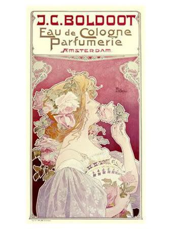
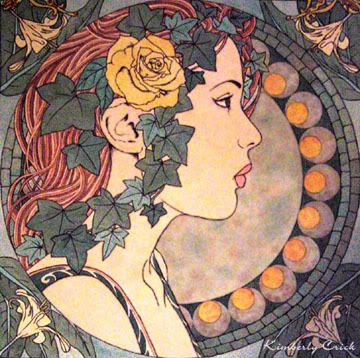
IMAGE USED


This is a image of the Binghamton Courthouse which will act as my landmark in the stamp design.

(subject to change)
DRAFTS
1st Round


2nd


ROUGH

FINAL

Successful Visual Communication
-Rhythm: Used in the word Binghamton to guide the eyes up from the corner of the stamp.
-Shapes: Shapes were used throughout the stamp. It was used in the double-joining circles at the bottom right corner of the stamp to act as a B. It was used in the digital rendering of the Courthouse in order to try and get off a Bauhaus feel.
-Balance: This was used with the US on the top of the stamp in order to balance out both the negative space and actual space of the stamp. I believe it gets a more relaxed feel, relaxed being not too fussy.
-Scale: Scale was a touchy topic when designing the stamp. The US with the inverted A was obviously the biggest aspect on the stamp in order to promote the country, then came Binghamton which is in the United States, then the history of the courthouse which is inside of Binghamton.
-Unity: The Bauhaus movement I believe is all about unity. I try to promote the unity withing the piece by using popular colors used by other artist using Bauhaus techniques. I also tried to incorporate Bauhaus with a little bit of Constructivism to get unity among the letters, angles and numbers.
Objective Achieved?
Well the primary objective was to basically make a stamp. My objective was to make a stamp and with the help of the Bauhaus technique, induce research. By that I mean if someone was to see the stamp in a distant land, the see the landmark and wonders to themselves, "what does the courthouse really look like?" With that providing they have access to the world wide web, they'll go on a small adventure to find out more about the small city, which has a lot of history.
Participation
I haven't excelled much. I enjoyed voicing my opinion, however I believe that I could have been more involved.